
Lately, I’ve been thinking a lot about the city of Atlanta, where a fire recently destroyed a portion of the I-85. It’s a major highway that hundreds of thousands of people use every day to access to their jobs, their schools, their groceries, and more. For me, the highway’s closure highlights how vital our transportation networks have become to quality of life in our communities. Even in a best case scenario, residents of the Atlanta region are likely to spend several months without this vital transportation connection – and the typical Atlanta resident already spends more than 70 hours in traffic each year. What can we, the transportation community, do to limit the negative consequences of unforeseen events like this? It’s not a simple problem for anyone to solve, and we know that the folks in Atlanta are working day and night to solve it. In this blog post, I will describe a few data-driven tactics for reducing congestion misery on I-85 in Atlanta. We hope that this analysis will be useful for detour management in Atlanta in the coming months.
This analysis is based on anonymous location data that was generated by mobile devices and connected cars that used the affected segments of I-85 between 8am and 10am on weekdays during the 12 months prior to the collapse. I used StreetLight InSight® to process this location data into the Metrics described below.
Who’s Using the Road?
Our first step was to find out who is affected by the I-85 closure, and why they’re usually on that road. This type of information is valuable for guiding a city’s high-level planning. Figure 1 (below), shows the trip purpose of these drivers. This indicates if drivers began and ended the trips in either residential (RESI), commercial (COMM), or other types of zones (OTHER).

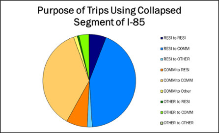
Figure 1: The above chart shows the share of trips that began and ended in each type of zone. The vast majority of trips ended in commercial zones – almost 80%. Because we looked at trips that took place between 8am and 10am, these drivers are likely to be commuters.
Figure 2 (below) shows the income breakdown of the drivers. It may seem simple, but measuring all citizens, and showing citizens that they’re being counted, can go a long way for stakeholder relationships. It also helps ensure that the impacts on underrepresented groups – or simply less vocal groups – are accounted for.
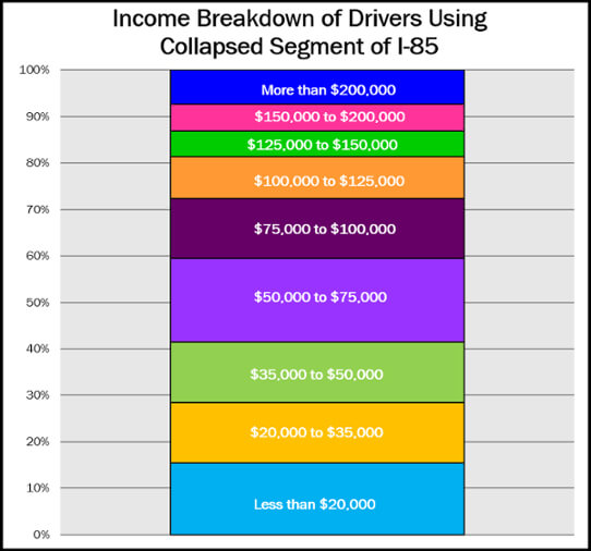
Figure 2: The above chart was derived using census data for the residential zones where drivers began their trips. Almost 30% of drivers are likely to live in households with an annual income of less than $35,000.
Where Are They Going?
Our second step was to find out where drivers using the collapsed segment begin and end their trips. This is critical for identifying the best alternate routes.
To find the most popular trip origins and trip destinations for the segments’ drivers, I ran a “select link” analysis. The map below shows the five most popular pairs. Each of these pairs represent about 0.5% of all traffic on the affected section of I-85 NB during the weekday rush. With this data, the city can prioritize outreach to employers in these areas.
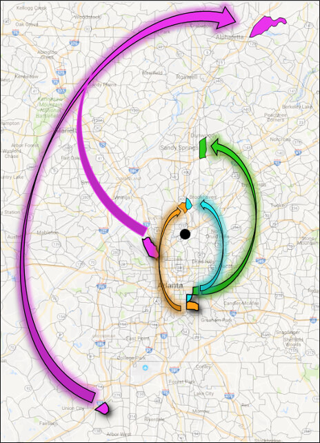
Figure 3: The map above shows the top five origin-destination pairs for drivers on a typical weekday morning on the affected section of I-85 NB. Each pair is shaded a different color. The collapsed road segment is identified with a black circle. We used transportation analysis zones (TAZs) as our origin and destination zones. Employers and residents in these TAZs should be prioritized for demand management outreach and planning.
It’s interesting to see that the fuchsia pairs share the same destination transportation analysis zone. In addition, this destination is quite far from the collapse area – about 23 miles as the crow flies. Thus, this destination could be a great candidate for bus/shuttle service, and may also offer more compelling re-routing opportunities.
The orange, blue, and green pairs may have a more cumbersome rerouting path because they are closer to the collapsed segment. However, the destination zones are also all fairly close to each other, especially the blue and orange pairs. Perhaps a shuttle or carpooling plan could follow the path shown by the arrows in Figure 3.
We could also look at the 2nd most popular route taken by drivers between these pairs (after I-85) during the months before the collapse. That route could be the best choice for a detour. Finding detours that avoid that sector of the city altogether wherever possible will reduce the load of the detour that currently rests on the shoulders of the nearby roads.
Where Do They Work?
I was also able to highlight key office parks whose workers use the segment. A targeted outreach campaign to these employers – perhaps offering support for employee shuttle and public transit passes, or suggesting work-from-home programs – could be a very cost- and time-effective way to help control demand during construction.
The following map (Figure 5) ranks a set of comparably sized office parks by which has the most commuters impacted by the closure. The Piedmont Center has by far the most commuters impacted. This makes it a better candidate for demand management programs than the other office parks nearby. That may be surprising because it’s not the closest park to I-85, and it’s not even the one that is actually on I-85.
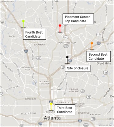
Figure 5: Ranking of select office parks by the number of commuters who were affected by the collapse of I-85 segment.
Similarly, we can identify the most affected home neighborhoods and give them targeted support. These types of engagement campaigns help stakeholders hold each other accountable to implementing policies and plans put in place that actually do make a difficult situation less miserable.
How Long Are Their Trips?
Rerouting is necessary, but reducing total trips and the length of trips can be even more impactful. Typically, planners try to shift short vehicle trips to other modes, such as transit, walking, or biking. Figure 4 shows a histogram of trip lengths for vehicles using the section of I-85. Of those trips, less than 2% were under 2 miles in a car. This means the odds of using non-vehicular alternatives (like biking or walking) are quite low.
However, we found slightly better news on the other side of the histogram. Nearly 30% of the trips are quite long, over 30 miles one way. This means that significant opportunities are likely to exist for rerouting trips around different parts of Atlanta. This could dilute the impact of the detours on the roads immediately adjacent to alternative routes.
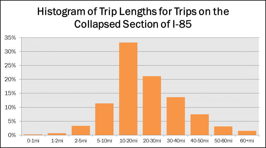
Figure 4: This chart shows the distribution of the length of trips that used the collapsed section of I-85.
Conclusion
No matter how fast construction occurs or how effective demand management programs are, people aren’t going to be thrilled about driving in Atlanta over the next few months. However, by openly demonstrating their commitment to data, and by measuring and updating key indicators of performance during construction, and by altering detour and demand management programs if they prove ineffective, community leaders can communicate their commitment to their stakeholders. With the right data, they may even be able to save money on the entire detour and demand management process.